Weddings - Colour Basics
 This year’s bridal consultations have definitely contained lots more discussions about the use of bolder colour palettes. This has been in contrast to previous years when the conversations have centred around adding colour to an essentially white or ivory scheme. In the last couple of years popular colour combinations have been shades of green and white, hues of pinks with ivory and a range of the palest blush tones through to mocha shades.
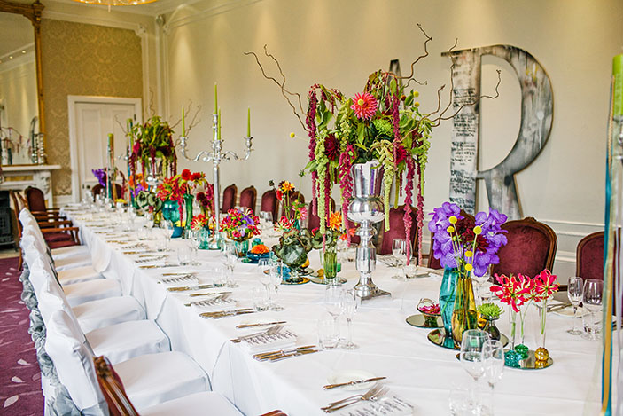
There are some keys areas where you can introduce colour into your wedding from the wedding stationery that arrives on guest's door mat, six months before the big day, right through to the table gift that your guests take away from the wedding.
With regard to the venue decor and styling, you have the following key areas to play with :-
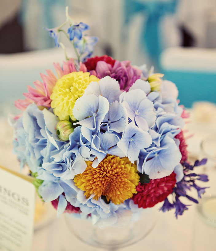
Flowers -
Table linen -
Table stationery -
Cake, sweet treats and fully styled dessert tables -
Other food and drinks -
Areas such as the card and present station, guest book table and table plan or escort table -
Installations and other room decor such as hanging decorations or directional signage -
Favours and table gifts -
A typical wedding colour palette will usually comprise of two main, base colours and one or two accent colours to provide highlights, and colour pops, to give the palette added interest. Try not to get too carried away with a wide range of colours unless you intend on throwing a ‘rainbow’ wedding!
Inspiration for your colour palette is likely to evolve from your wedding reception venue, the variety of seasonal flowers available at your chosen time of year and the atmosphere that you are trying to create for your big day (e.g. hot, jewel colours for an exotic and vibrant wedding theme). All of these considerations will be guiding factors when collating your colour combinations.
For example, if your venue has a prominent wall or carpet colour, you will need to choose a colour palette that is sympathetic to the backdrop. There are some occasions when trying to shoe-horn a particular colourway into a certain venue just won’t work. Our latest example of this is a client whose favourite flowers are buttercup yellow and shades of blue, staging their wedding in a hotel suite upholstered in maroon!
The best way to pull your colour palette together is by designing a moodboard, either digitally or a ‘tried and tested’ paper version. By collating lots of your favourite images you will soon identify the emerging colour trends. You then need to complete a mental checklist to ensure that those colours work with your guiding factors, such as the venue backdrop.
There is no doubt that a well chosen, well executed, colour scheme can make a wedding a really memorable, standout occasion. We regularly fall in love with a set of images on a blog because of the colour palette before we've even begun to study the beautiful details.
Above all, you have to be comfortable with your choice and make sure your chosen colour palette reflects you as individuals and has not been dictated by the mother-in-law to-be’s ‘must have’ bolero jacket from Jacques Vert!